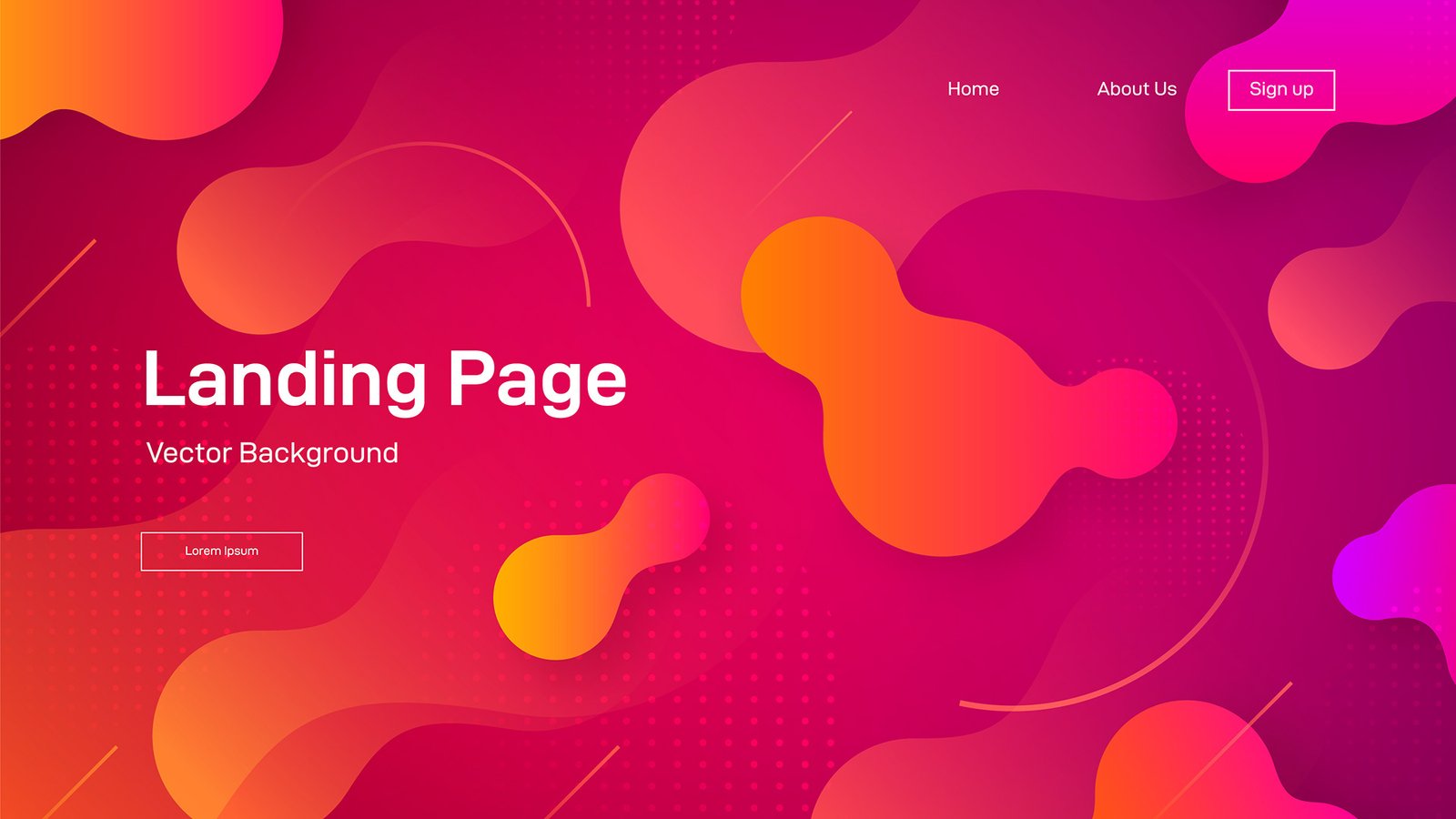
Introduction: The Science Behind Every Click
Landing pages aren’t just containers for offers—they’re the bridge between curiosity and conversion. Whether your goal is to get someone to sign up for a newsletter, buy a product, or book a free consultation, your landing page design can either push them forward or drive them away.
But what really makes a landing page convert?
It’s not just eye-catching visuals or trendy UI elements. High-converting landing pages are built on clarity, trust, and psychology—the deep understanding of what triggers people to say “yes.”
Let’s break down the core principles behind landing pages that actually work.
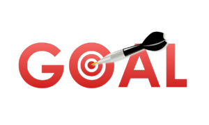
Principle #1: Start With a Single, Clear Goal
The number one mistake most businesses make? Trying to do too much.
A landing page is not your homepage. You’re not here to educate, entertain, or introduce every product in your catalog. You’re here to get a specific user to take a specific action.
Ask yourself:
-
Do I want the visitor to download an ebook?
-
Sign up for a webinar?
-
Buy now or start a free trial?
🔥 Pro Tip:
Remove navigation menus and extra links. Distractions kill conversions. Keep the user laser-focused on the main CTA (call to action).
Principle #2: Use the Power of Visual Hierarchy
Users don’t read—they scan. You have a few seconds to guide them toward your goal.
The right visual hierarchy helps visitors follow a clear flow:
-
Headline – Grab attention and clearly state the benefit.
-
Subheadline or Value – Reinforce why they should care.
-
Call to Action – Tell them exactly what to do next.
Use:
-
Bold, large fonts for headlines
-
Contrasting colors for CTA buttons
-
Whitespace to separate sections and improve readability
Visual hierarchy = less cognitive load = faster decisions.
Principle #3: Build Instant Trust
Even if your offer is great, no one takes action unless they feel safe.
You can build trust visually, structurally, and socially.
✅ Elements that boost trust:
-
Client testimonials
-
Star ratings or reviews
-
Security badges (SSL, payment icons)
-
Logos of brands you’ve worked with
-
Professional, clean design (avoid amateur or “DIY” layouts)
Trust isn’t a bonus—it’s a requirement for conversion.
Principle #4: Make It Mobile-First
Over 60% of landing page visits happen on mobile. If your page isn’t optimized for mobile-first design, you’re losing leads before they even scroll.
🧩 Mobile-first tips:
-
Use thumb-friendly CTA buttons (big, centered)
-
Prioritize vertical content flow
-
Avoid huge images that slow down load speed
-
Break content into bite-sized chunks
Fast, responsive, and touch-friendly = a smoother mobile experience.
Principle #5: Use Psychology to Nudge Action
Design isn’t just art—it’s behavioral science. Smart landing pages apply psychological triggers that nudge users to act.
🧠 Key triggers that boost conversions:
-
Urgency: “Offer expires in 2 hours!” (add countdown timers)
-
FOMO: “Join 5,000+ others who’ve already signed up”
-
Anchoring: Show an expensive price first, then show your discounted offer
-
Contrast: Use bold CTA buttons against neutral backgrounds to draw attention
The goal is to make action feel safe, logical, and immediate.
Examples of High-Converting Landing Pages
Learn from the best:
-
Dropbox Business: One CTA, minimalist design, strong headline
-
Notion: Clean visuals, benefits-first layout, action-oriented button
-
ConvertKit: Strong use of testimonials, clear trust indicators, focused goal
These examples succeed because they follow all five principles—no distractions, just clarity and value.
Bonus: Landing Page Checklist
Before you publish, run through this:
✅ Clear headline that communicates a benefit
✅ One single, focused call-to-action
✅ Social proof (testimonials, reviews, ratings)
✅ High-quality visuals and clean layout
✅ Mobile-optimized and fast loading
✅ No distractions—remove unnecessary links
✅ Strong CTA above the fold and at the end
✅ Psychology triggers: urgency, scarcity, social proof
Final Thoughts: Design Less, Convert More
Landing pages aren’t about showcasing your creativity—they’re about getting results. And that means doing less, but doing it with intention.
When you combine user-centered design, persuasive copy, and psychology-backed structure, you don’t just drive traffic—you convert it.
So the next time you’re building a landing page, remember:
✅ Don’t just design for beauty.
✅ Design for clarity.
✅ Design for trust.
✅ And most importantly, design for action.
this is comment to be visible